

Slide: The First Instant Cash Back App.
Led product design, branding, marketing and illustration for Slide from concept to launch — shipping a cash back app MVP in seven months on a design system that supported years of feature releases.
problem
Every cash back app made users wait weeks for payouts.
How might we pay them the moment they buy?
Product Design Manager
Lead Designer — product design, branding, illustration, and marketing design, from ideation to launch.
My role
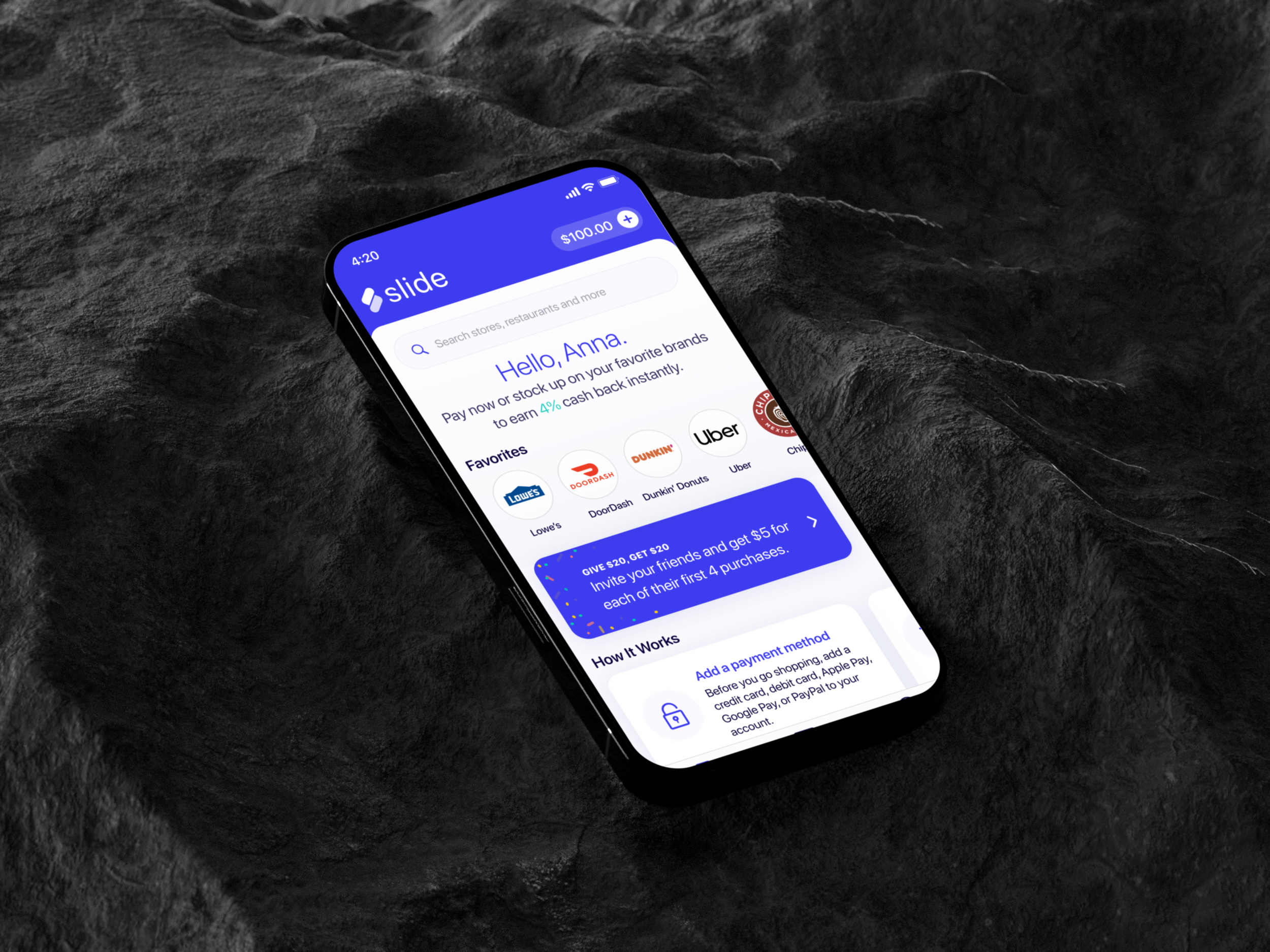
overview
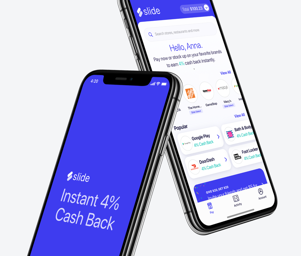
Every cash back app made users wait. Payouts took weeks to arrive, landing long after the purchase that earned them — and by then the reward had stopped meaning anything.
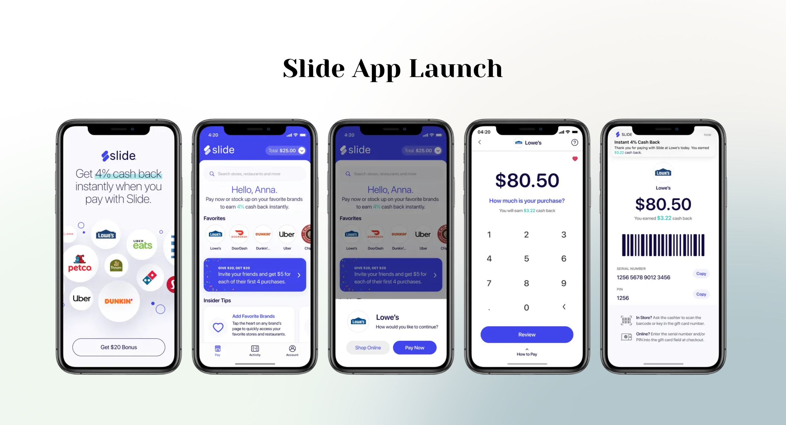
Slide broke that constraint with a mechanism no one else in the category was using: running cash back on the back of gift cards. Because gift card value transfers at the point of purchase rather than settling through a merchant reconciliation cycle, cash back could land in a user's wallet instantly. Slide was the first app to do it.
I led product design, branding, illustration, and marketing design from initial concept through launch. Working against a tight timeline with limited resources, I partnered with a two-person development agency to establish the foundational flow, then built the visual identity and component-based design system that carried Slide from MVP to a sustained post-launch roadmap.
The MVP shipped in July 2020, roughly seven months from first concept. The design system built for it supported more than a dozen major feature releases in the years that followed. In 2025, Slide was absorbed into the Raise app (Raise Marketplace).
background
The problem
Cash back has always carried a delay. Payouts settle through merchant reconciliation, which means the money reaches a user's wallet weeks after checkout — disconnected from the purchase that earned it and from the decision to shop again. The reward arrives too late to do the work a reward is supposed to do.
The entire category accepted this. The delay is a function of how the money actually moves, so it read as a fixed cost of the business rather than something a product team could design around.
The opportunity
Gift cards move differently. Their value transfers at the moment of purchase instead of settling downstream, which meant cash back could be paid out instantly — not faster, but immediately.
No one else was building on this. That made Slide's premise genuinely novel: the first cash back app to pay users in the moment, using gift cards as the mechanism that made it possible.
The design problem
A novel financial mechanic is only an advantage if users grasp it immediately. Instant cash back had to feel obvious rather than clever, which set the design mandate for the entire product:
How do we build a cash back app simple enough that an unfamiliar mechanism feels effortless — and do it with a tight timeline and almost no resources?
To move quickly, we brought in a two-person agency known for app development. Over an intensive two-month period, the Slide team and I worked alongside them to produce initial wireframes, run user tests, and explore branding concepts. That sprint gave us the foundational flow.
It also clarified what remained: finalizing MLP features, defining the brand and launch plan, and building out the rest of the app — the work that would define what Slide actually felt like to use.
approach
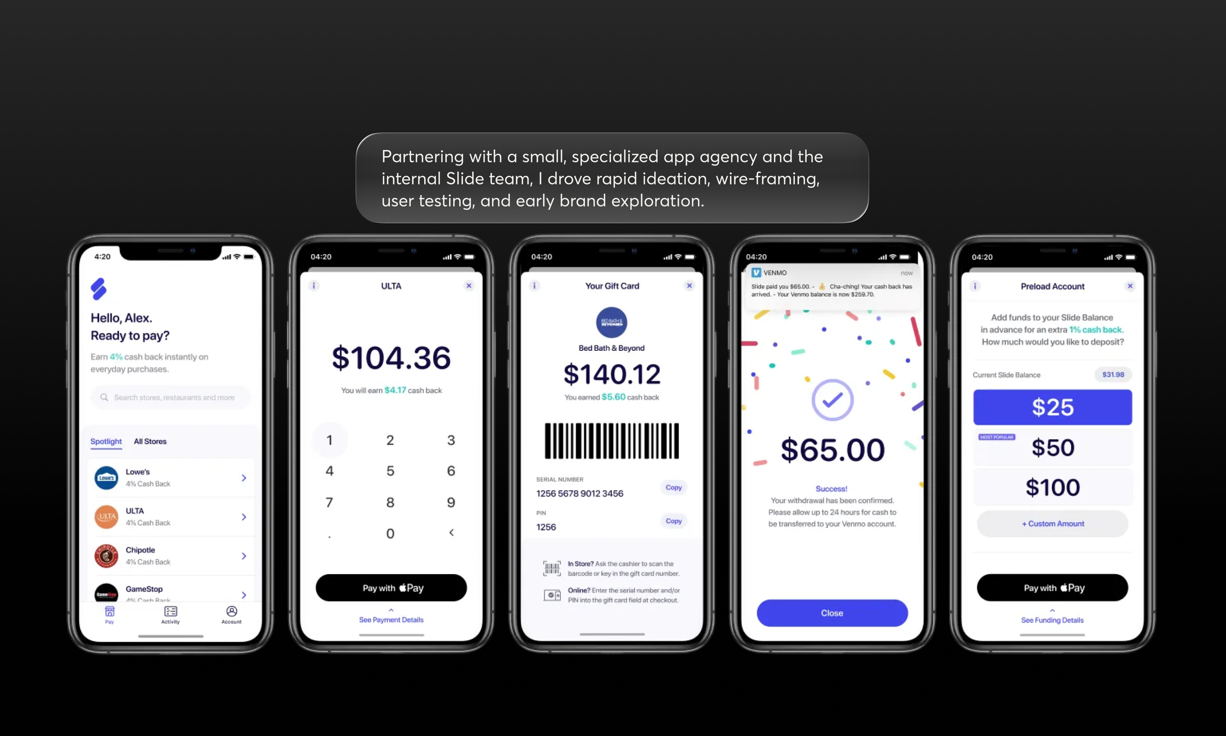
With the basic framework in place and simplicity as the guiding constraint, I ran a competitive analysis across cash back, discount, and financial apps to identify the patterns that made the best ones feel effortless. Four principles came out of it, and they became the rules the design system was built on:
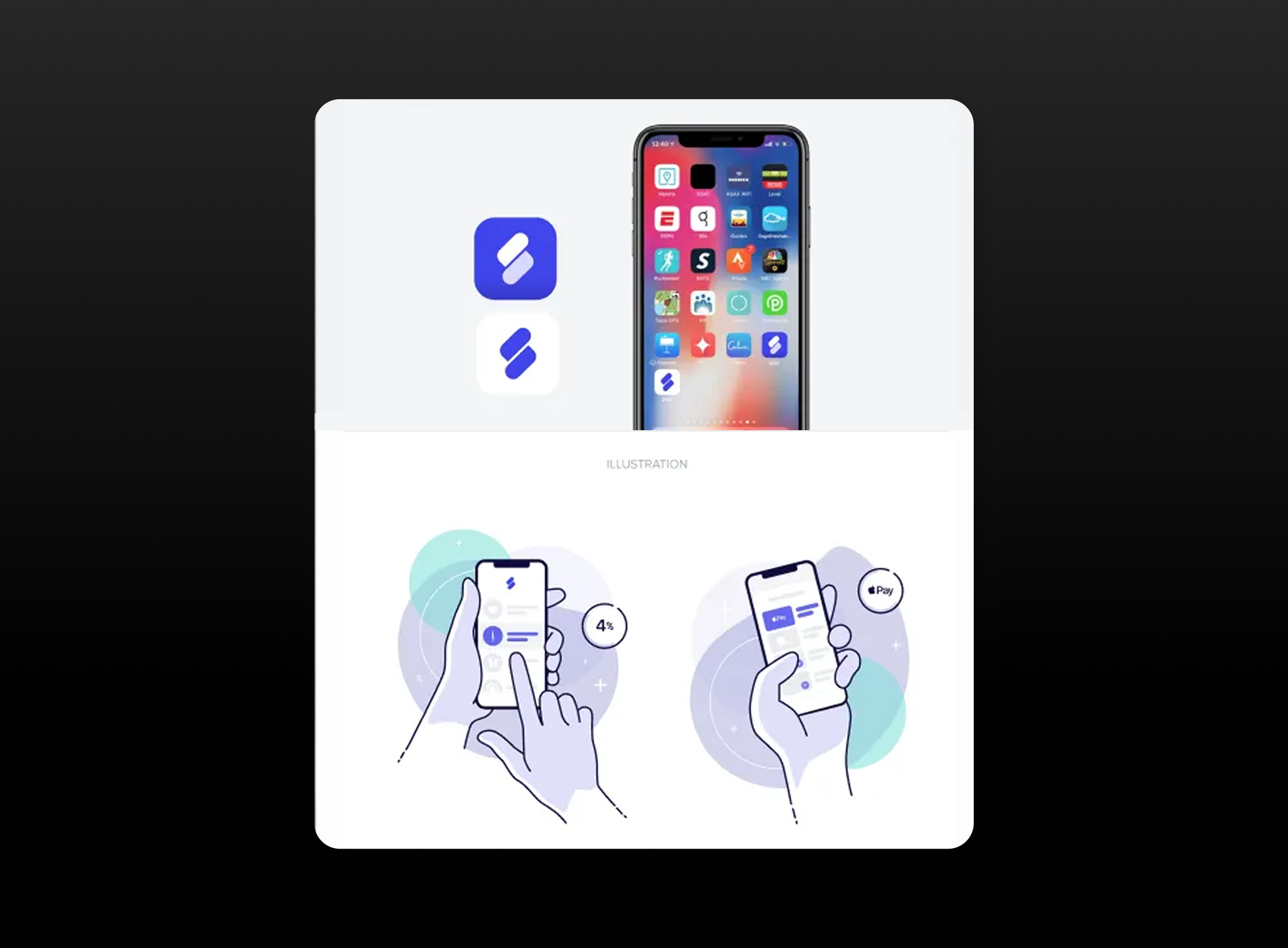
Keep it simple. The strongest apps used a single color to highlight the most important and relevant information.
Illustrate it. Illustration explains complex ideas efficiently and brings authenticity to light interfaces.
Typography and hierarchy. One font reduces clutter and makes hierarchy legible.
Repetition. A component-based design system lets visual patterns emerge and repeat throughout the app.
Establishing the visual direction
I developed several concept boards for consideration. Building them meant researching not only products in our space but current and emerging trends in UI/UX, color, illustration, and visual design — because the branding needed to scale beyond launch into every marketing asset that would follow.
Partnering with my product manager and the executive leadership team, we aligned on a simple, clean, and impactful direction.
Building the system
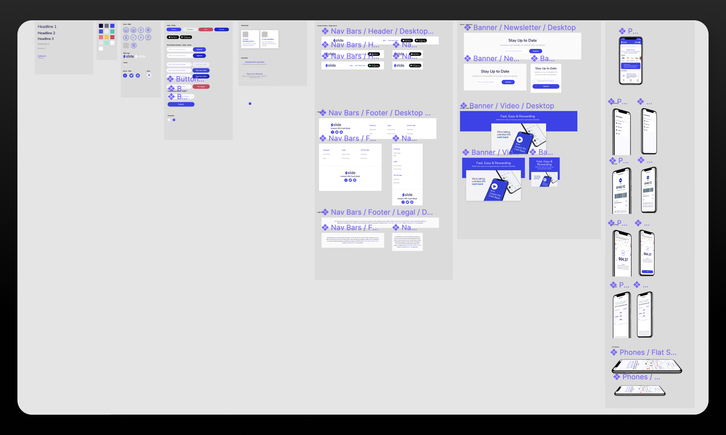
With leadership and product aligned, I built out the design system — as much a communication tool between me and the developers as a design artifact. It covered logos, typography, the color palette, and the core UI components: buttons, controls, lists, icons, alerts, and more.
That system is what made the post-launch roadmap possible. Every feature that shipped after MVP was assembled from parts that already existed and already agreed with each other.
solution
Slide launched as a cash back app built on four principles made concrete:
One accent color carrying emphasis, custom illustration doing the explanatory work that dense copy would otherwise do, a single typeface establishing hierarchy, and a component library making every screen feel like part of the same product.
For the team, the deliverable was equally the system behind it — a shared vocabulary of logos, type, color, and components that let a very small group ship a consumer financial product on a compressed timeline and keep shipping afterward.
outcomes
*
outcomes *
Outcomes
MVP v1.0 — Initial concepts began in late 2019; the MVP launched in July 2020
Features released since MVP — the design system supported a continuous release cadence, including:
Purchase limits per brand
ACH and BitPay as prefunding payment methods
Referral credits and a full referral program
Promotional credits
In-app browser for online shopping
New Pay Tab UI, with balances surfaced on the tab
Updated onboarding flow
Favorites
Set denomination purchases
Bouncer integration
Slide Selects — premium brands purchasable with varying combinations of earned cash back, credits, Slide balance, and credit/debit cards
LATE 2025 — The Slide app was reskinned and is now the Raise app (Raise Marketplace).
Reflection
Slide is the clearest evidence I have that constraints sharpen design rather than limit it.
A two-person agency, a compressed timeline, and a small internal team meant there was no capacity to design the same problem twice — which forced the design system to come early, when it's usually treated as something you get to once the product exists. Building it first is why a small group could ship an MVP in seven months and then sustain years of feature releases without the interface fragmenting.
The competitive analysis also taught me something about what to take from competitors.
The useful findings weren't features to copy but principles about restraint — one color, one typeface, illustration instead of explanation. In a category where products compete by adding, the differentiating move was subtraction.
If I were doing it again, I'd push harder on defining success metrics alongside the visual direction.
The feature list after MVP shows real momentum, but the story would be stronger with adoption and retention numbers attached to specific design decisions — and that's an argument that has to be made before launch, not after.